














Most business owners who ask me for an Airtable dashboard already know which numbers they wish they could see. What they don’t have is a way to see them without spending an afternoon pulling reports from three tools into a spreadsheet. A dashboard fixes that, but only if the data behind it is structured for reporting and arrives without someone typing it in.
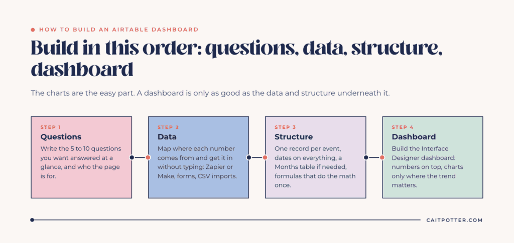
As a systems strategist, I build custom dashboards in Airtable for service businesses, and the charts are the easy part. This post walks through the order I build in: questions first, then data, then structure, then the dashboard itself.
Building a dashboard for a board or funders? See how I set up nonprofit systems that make those reports quick to pull.
Start with the questions, not the charts
A dashboard answers questions. If you start by picking chart types, you end up with a page of pretty graphs nobody checks. Start by writing down the five to ten questions you want answered at a glance. For example:
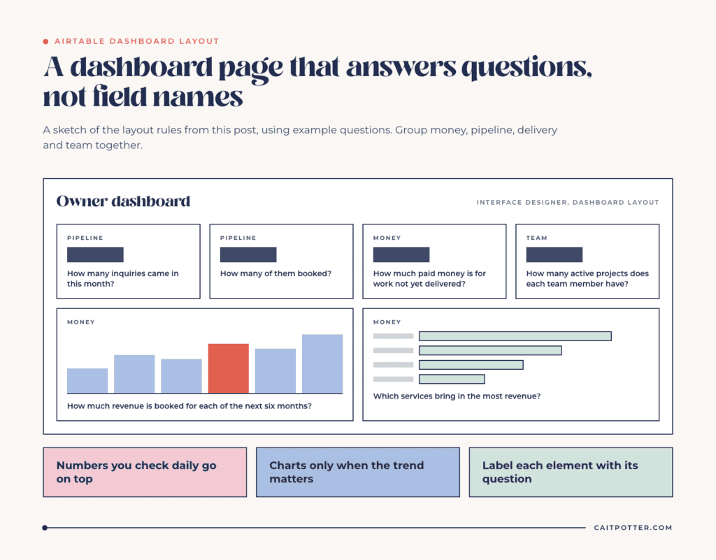
- How much revenue is booked for each of the next six months?
- How many inquiries came in this month, and how many booked?
- Which services bring in the most revenue?
- How much money that’s been paid is for work not yet delivered?
- How many active projects does each team member have right now?
Each question tells you what data you need, how often it has to update, and which tool it currently comes from. That list becomes your build plan.
Also decide who the dashboard is for. An owner usually wants money and pipeline. A project manager wants deadlines and workload. A bookkeeper wants payments and what’s outstanding. Trying to serve all three on one page makes it harder for everyone to read, so I’ll often build one dashboard page per role, all fed by the same tables. The data stays the same. Only the view changes.
Get the data in without typing it
A dashboard that depends on manual entry stops being accurate the first busy month. So the next step is mapping where each number comes from and how it gets into Airtable.
The common routes are:
- Integrations through Zapier or Make. When a client books, pays or completes a project in your client management tool, a new record is created in Airtable.
- Airtable forms for anything your team reports on, like hours, check-ins or wrap-up notes.
- CSV imports for historical data you want to compare against.
- Manual entry for the few numbers no tool tracks. Keep this list short and specific.
For Live Wilder Studio, Zapier sends data from Dubsado to Airtable when a lead inquires, when a client books, when a job is completed and when a payment comes in. Additional Zaps bring in Google reviews and completed tasks from ClickUp. The result is 28 datapoints in one dashboard, with only two things entered by hand each month.
Structure tables for reporting
This is where most do-it-yourself dashboards break. Data that’s easy to enter isn’t always easy to report on.
One record per event
Store each payment, booking or inquiry as its own record with its own date. Don’t keep a running total in one cell. Totals should be calculated from the records, so you can always see which records make up a number and filter them by month, service or client.
Dates on everything
Every record that feeds a dashboard needs a date field that means one thing. A payment record should have the payment date, not the date someone noticed it. When dates are clean, “this month,” “last quarter” and “same month last year” are all just filters.
A months table, if you need it
For month-by-month reporting, I often add a Months table where each record is one month. Payments, bookings and inquiries link to their month, and rollup fields total them. That gives you one row per month with every metric side by side, which is easy to chart and easy to check.
Formulas that do the math once
Put calculations like profit, conversion rate or average project value in formula fields, not in your head. Once the formula is right, it’s right for every record.
Build the dashboard interface
Airtable’s Interface Designer includes a dashboard layout, which Airtable describes as charts and number elements on one canvas for reporting and at-a-glance metrics. Interface Designer is available on all plan types, including Free, though some visualizations, like timeline, are limited to paid plans.
A few rules I follow when building the page itself:
- Put the numbers you check daily at the top as single number elements.
- Use a chart only when the trend matters more than the current value.
- Group related metrics together: money, pipeline, delivery, team.
- Label each element with the question it answers, not the field name.
Owners and Creators can build and publish interfaces. Everyone else sees what they’ve been given access to, which means you can share a dashboard with a team member without giving them access to every table behind it.
Keep it accurate after launch
A dashboard people stop trusting is worse than no dashboard. Three habits keep it reliable.
First, one source of truth for every number. If revenue comes from Dubsado, it only comes from Dubsado. Don’t let someone correct it in Airtable by hand. Second, check your integrations regularly. Zaps fail quietly when a field changes or a connection expires, so I build a simple view that shows when each source last sent data. Third, review the questions every few months. A business changes, and the dashboard should change with it.
What it costs to run
The Airtable Free plan allows 1,000 records per base and 100 automation runs a month. A dashboard that logs every payment and inquiry usually outgrows that within a year. The Team plan is $20 per user a month billed annually and allows 50,000 records per base. On the Team plan, people who can edit or comment count as paid users, and read-only collaborators aren’t charged, so a team that only views the dashboard doesn’t add cost. Zapier has its own pricing, and the plan you need depends on how many tasks your Zaps run each month.
Building it yourself or having it built
If you’re comfortable with linked records, rollups and formulas, you can build a solid dashboard yourself by following this order. If you want it done right the first time, with integrations that don’t break when you rename a field, that’s what my custom dashboard creation service is for. And if your dashboard is part of a larger Airtable system, start with Airtable setup. If it has to pull several platforms together, that’s a custom system build. Before you build anything, it’s worth reading about return on investment with a systems strategist, because a dashboard should pay for itself in hours saved.
Frequently asked questions
Can you make a dashboard in Airtable?
Yes. Airtable’s Interface Designer has a dashboard layout with charts and number elements, and it’s available on all plan types.
Is Airtable good for business reporting?
Yes, when the data is structured for reporting: one record per event, clean dates and calculated fields. It’s especially useful for combining data from several tools.
How do I get data from other tools into an Airtable dashboard?
Most often through Zapier or Make, which create Airtable records when something happens in another tool. Forms and CSV imports cover the rest.
Can I share an Airtable dashboard without giving access to all my data?
Yes. Interfaces let you share a page with a collaborator so they see what’s on that page without working in the underlying tables.
Ongoing COO-level support to maintain and refine your systems as the business grows so operations stay steady and decisions stop piling up on your plate.

Support
Custom Dubsado, Airtable, and Moxie systems designed for capacity, not survival. Built around how your business actually runs so growth does not create more chaos.

Systems
Map, audit, or optimize the system that is slowing your business down. Workflows, offers, tech stacks, or the process that keeps living in your head instead of your business.

Strategy
services
These are.
Busy isn't a business plan.


In this power-packed session, I show you how to connect Airtable + your CRM for smarter tracking, simplified workflows, and insights that actually move your business forward.
From Guesswork to Growth with Airtable


A step-by-step guide to setting up your new Dubsado account, area by area, so your trial ends with a system you can actually use.
21 Ways to Max Out Your Dubsado Free Trial

Hot Seat, Hot Takes, Hot Damn.

Free masterclasses that show you exactly how scalable businesses are built.




© 0000 Cait Potter Creative, LLC
Privacy Statement and Terms & Conditions